How to Design for Accessibility When Building A New Website

By Erica Statly on Oct 23, 2018
Web accessibility is important because it guarantees that the internet will be accessible to everyone, regardless of any disabilities. It is a way of ensuring that those who have vision impairment, hearing impairment, learning disabilities, limited movement, speech disabilities or photosensitivity can still easily and equally access websites. In order to make this happen, it’s important to keep accessibility standards in mind and design for accessibility right from the start. Use these 12 steps as a guide when designing your website to avoid any accessibility issues.
12 Steps to Design for Accessibility
Choose a content management system that supports accessibility
To design for accessibility, you need a solid foundation. Choosing a content management system (CMS) that supports accessibility will make this process easier for you. The easiest and most popular content management system is WordPress. However, be cautious when using WordPress themes. WordPress as a platform is already quite accessible, but some of the themes often fall short. WordPress themes designed for accessibility and tested by users will give you a good place to start.
Have a strategy for color
Part of web accessibility is designing for users who are colorblind. Sometimes websites don’t have enough contrast between colors, making it difficult for people with colorblindness to see all content. To design for accessibility, make sure there is significant contrast between the background and the foreground. Additionally, do not rely on color alone to convey important information. A good rule of thumb is a color contrast ratio of at least 4.5:1. Make sure you have a strategy set in place before beginning the design process to make sure color does not create an accessibility barrier on your website.
Organize your web accessibility step by step. Download the Ultimate Web Accessibility Checklist >
Don’t use tables for layout
The World Wide Consortium no longer considers tables used in layout to be a good practice, for the sake of accessibility across multiple different interfaces and devices. Layout tables are complex, and this can be difficult for screen readers to comprehend, therefore complicating accessibility. In an attempt to separate content and structure from the physical presentation of a website, do not include tables as part of your plan for layout with your new site.
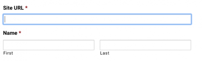
Design forms for accessibility
Forms play an important role in the design of your website; this is often a pivotal way that users interact with your site. Therefore, making these forms accessible should be one of your top priorities. When creating your form fields, make sure you use labels instead of placeholder text. Screen readers register labels, but not placeholders. Use a tag to offer a description, so screen readers can interpret the purpose of forms. Make any areas that require a button a large and clickable area. Be sure to set up error messages so they are easily seen, easy to understand, and accessible to screen readers. In WordPress, you can build form templates that you can reuse multiple times. This saves you time while ensuring your forms are up to accessibility standards down the road.
Alternatives for images/media
Providing text alternatives (AKA alt text) for images or any other media is a quick and easy fix for web accessibility. Always keep in mind that someone who is visually or hearing impaired may be trying to use your site. How are they supposed to understand what the image, video or audio conveys if they cannot see or hear it? Provide text alternatives for images and video, and consider inserting an audio transcript to make audio pieces accessible.
Place navigation in clear & consistent places
Site navigation can quickly become a big obstacle for web accessibility. It’s ideal to have multiple ways to navigate your site, especially if your site is large. Placing your navigation menu at the top bar on your site is the easiest method. However, it does not have to be here. Sidebar navigation can be just as effective. You might also use a sitemap or a search bar to make navigation easier. Just make sure that it’s also mobile responsive, and keep navigation in the same place across every page on your site.
Focus indicators
A focus indicator is something such as the blue box that outlines the button in a form field when you’re filling it out.
Basically, it’s a visual indicator to show which element of a web page the user is focused on. This is especially helpful for users who use a keyboard to access your website, as it clearly conveys where they’re at on a page.
Strategy for links
The World Wide Web Consortium requires link text to accurately describe the purpose of links. This is for those with screen readers to understand what links throughout a page mean. This can help them determine whether or not they would like to follow that link. If a link contains no text, or the linked text isn’t clear, then the purpose of that link cannot be properly explained to the user. As you plan your new site, make sure you keep these tips in mind so you don’t have to go back later and fix an overwhelming amount of links.
Use headings appropriately
You want to set up headings according to their level. Levels range from H1 to H6. Higher levels (H1’s, H2’s, H3’s) indicate the start of a new section and headings such as H4’s or H5’s may indicate subheadings within those sections. Try not to make this structure confusing. The World Wide Consortium advises against using headings out of order, such as an H4 directly below an H2, since it can quickly make content confusing to people using screen readers or other assistive technology.
Design for different platforms
Something to keep in mind while designing your website is to make sure that it is fully accessible across all possible devices and platforms. It must be accessible via mobile, tablet, desktop, etc. This means you must consider color, layout, forms, alternatives for multimedia, navigation, focus indicators, links and headings for each platform as well. Using a CMS system like WordPress can help ensure this is a smooth process, and testing tools like Accessible Metrics tools can help you double-check your work.
Web accessibility can be stressful, since noncompliance can expose your business to lawsuits or expose your government department to penalties. Utilize these steps to protect your website as much as possible, and keep up with regular accessibility maintenance to make sure nothing falls through the cracks.